A few months ago, I wrote about some CSS findings from the new Facebook design. This morning, I logged out of my Facebook account, and I noticed that the login page has a new design which didn’t roll out with the redesign. I got curious to check and inspect the CSS behind it. I found some interesting bits that I want to share with you.
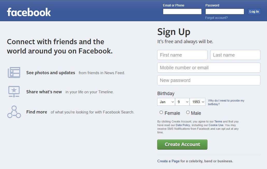
First, let me show the old design of this page.
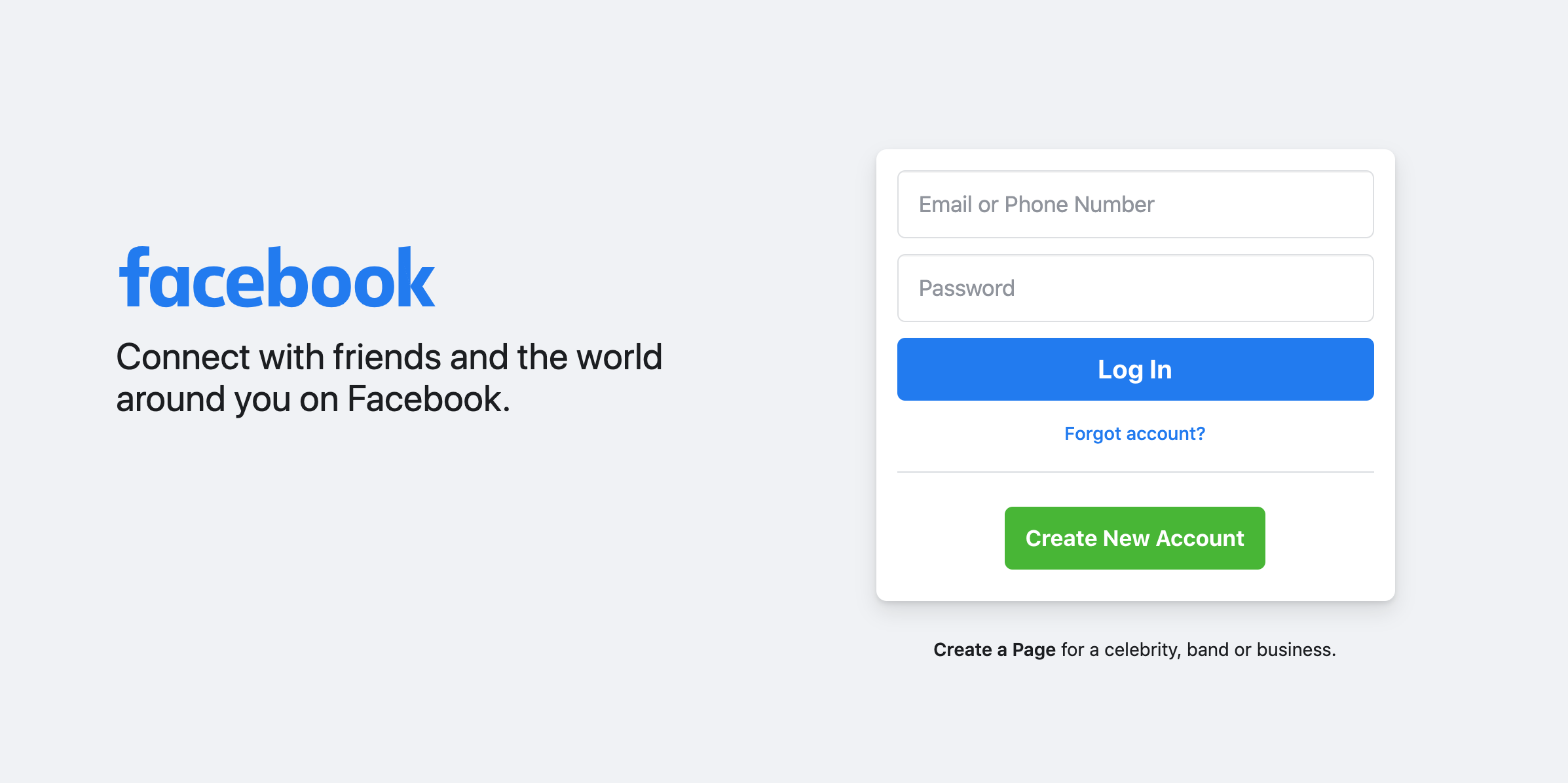
And here is the redesigned one.
Much better, right? Now let’s dig into the CSS details.
Layout
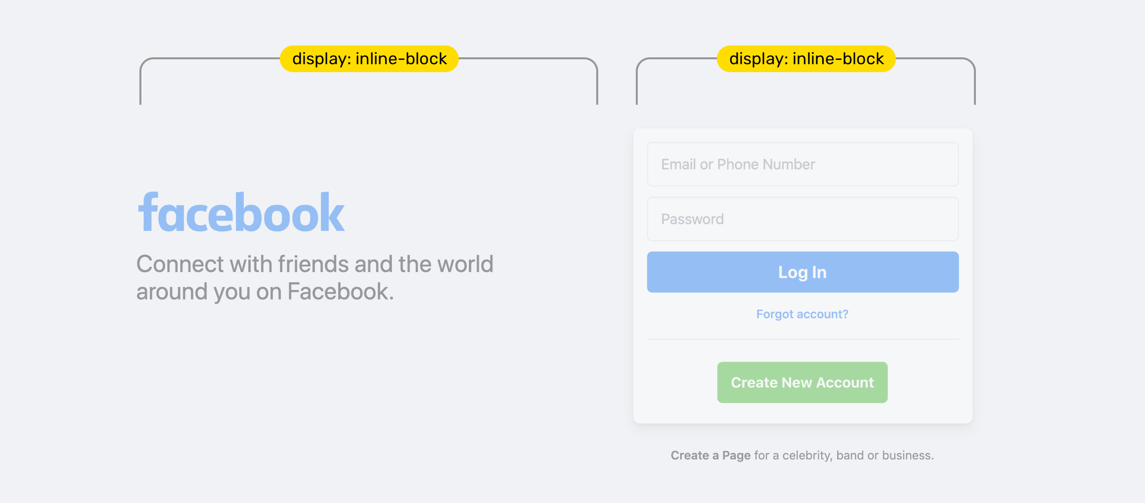
I liked that they used the good old display: inline-block to each item. As far as I know, this works on IE and other legacy browsers. I expect that the reason for using such a layout method is to ensure that the login page can be accessible to as many users as possible.
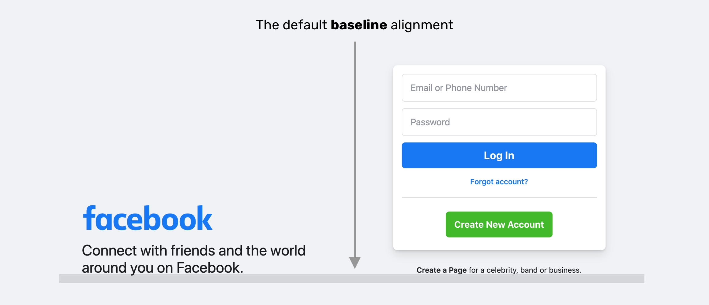
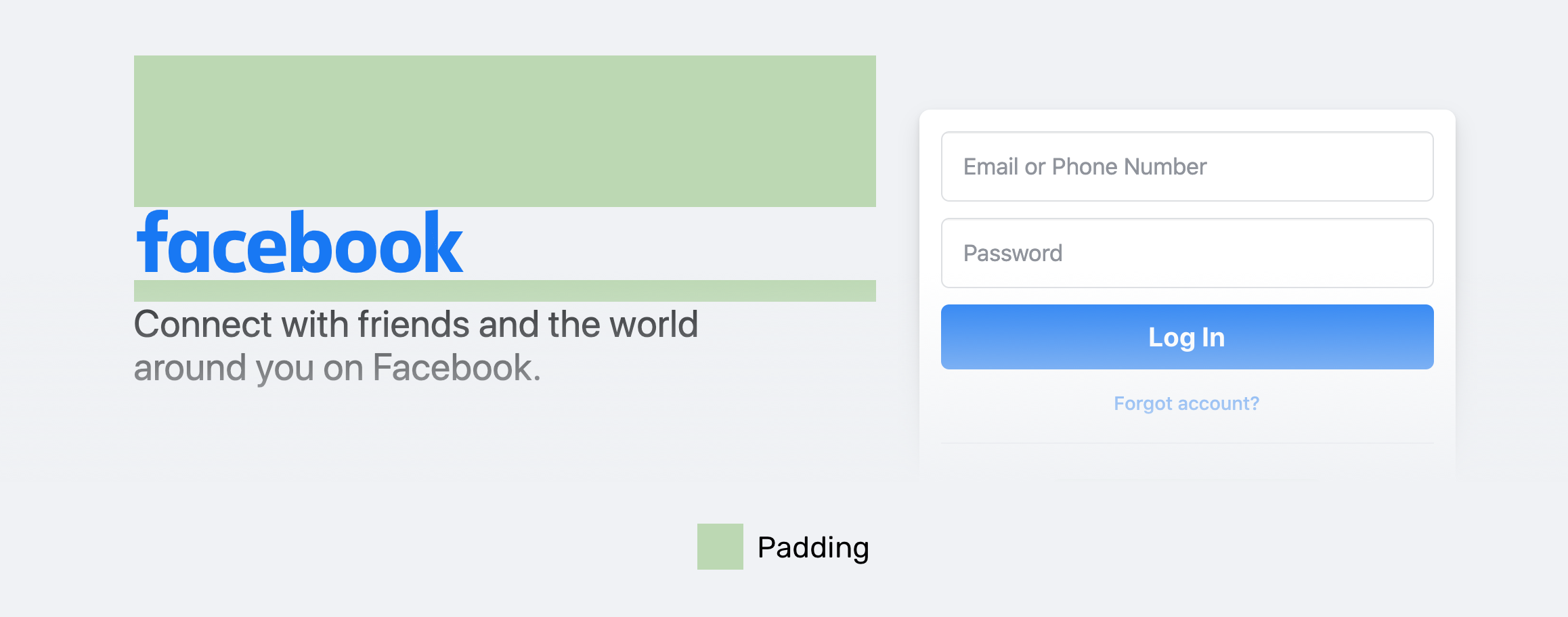
By default, an element with inline-block will be aligned to the baseline. The team at Facebook used vertical-align: top. See the below figure for how the elements will look with vertical-align: baseline.
If vertical-align: top were used, then how the items are centered vertically? Well, padding to the rescue. The highlighted green is the padding.
I don’t know if using vertical-align: middle instead is not suitable for this case. I mean, maybe the team has a reason to use padding instead of vertical-align. I tried using vertical-align: middle and it works as expected.
Form Inputs
I wonder why box-sizing: border-box hasn’t been used for the form inputs? Each input has a fixed width. This sounds weird in 2020. As per Can I Use, CSS box-sizing is supported in IE8+. So why deal with fixed values instead of percentages, for example?
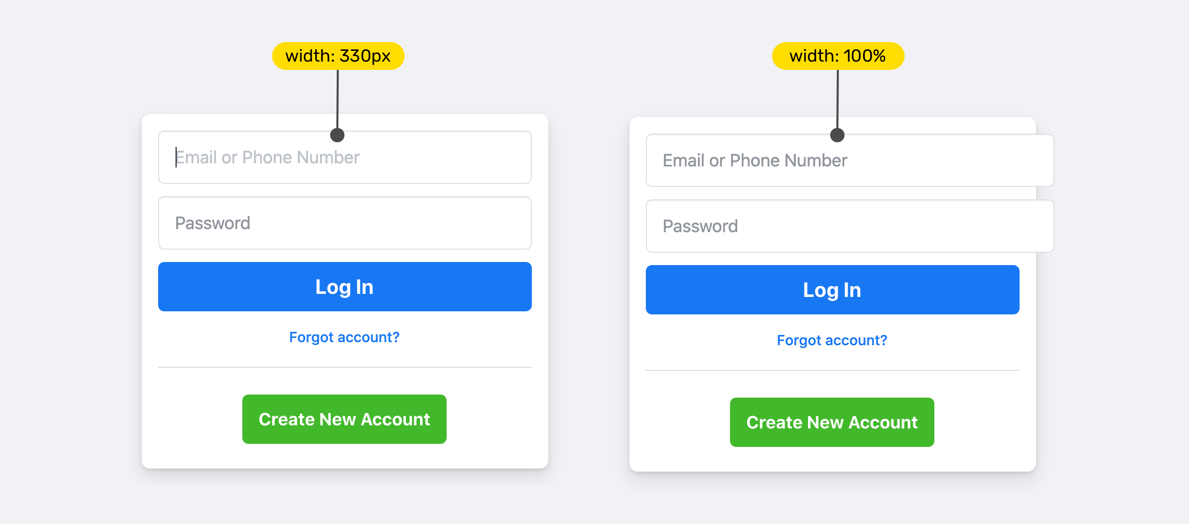
I tried to break the layout by adding width: 100% (right image). The input went out of its parent boundaries because box-sizing: border-box is not defined. The 100% is equal the following:
initial width + padding-left + padding-right + border-left-width + border-right-width.
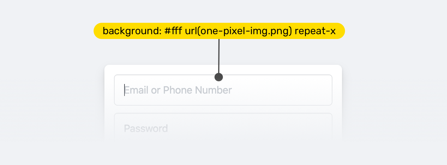
Adding on that, the input has a 1px*1px transparent background image. I don’t know the purpose of it. Anyone can help with this? My observation would be that this image is used as a way to monitor visits to the login page, maybe?
Spacing
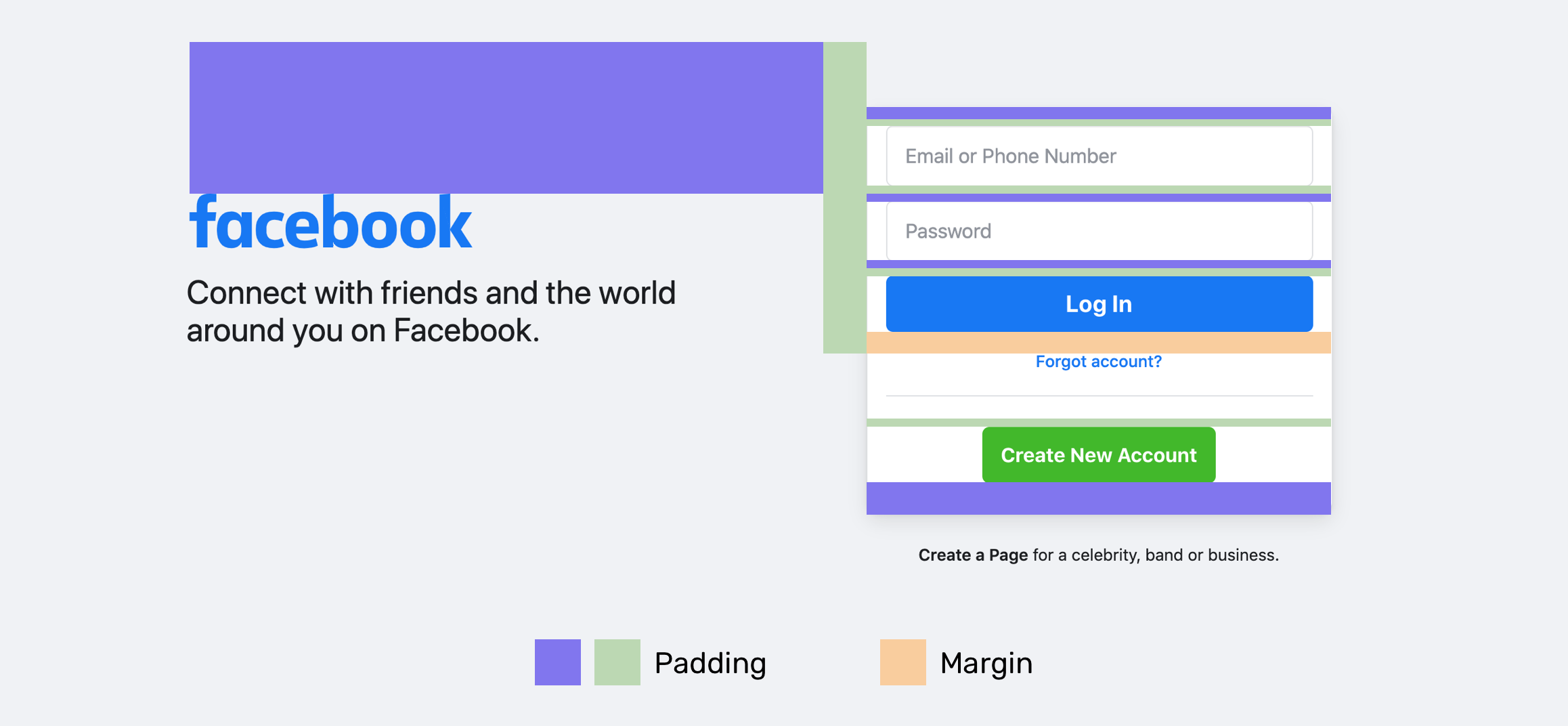
There is no clear direction of how spacing is used. There is a mixed-use of padding and margin. Here is a mockup that highlights the spacing. I used multiple colors for the padding to avoid confusion as the inputs have padding-top and padding-bottom.
Centering
I liked the use of the simple yet powerful text-align: center to center the whole form elements. See the video below for how it works.
Weird Logo Spacing
While inspecting, I noticed a weird negative spacing for the Facebook logo. Only to realize later that the spacing is added to kinda align the logo with the text. The reason is that the logo image has spacing (Transparent pixels) around it.
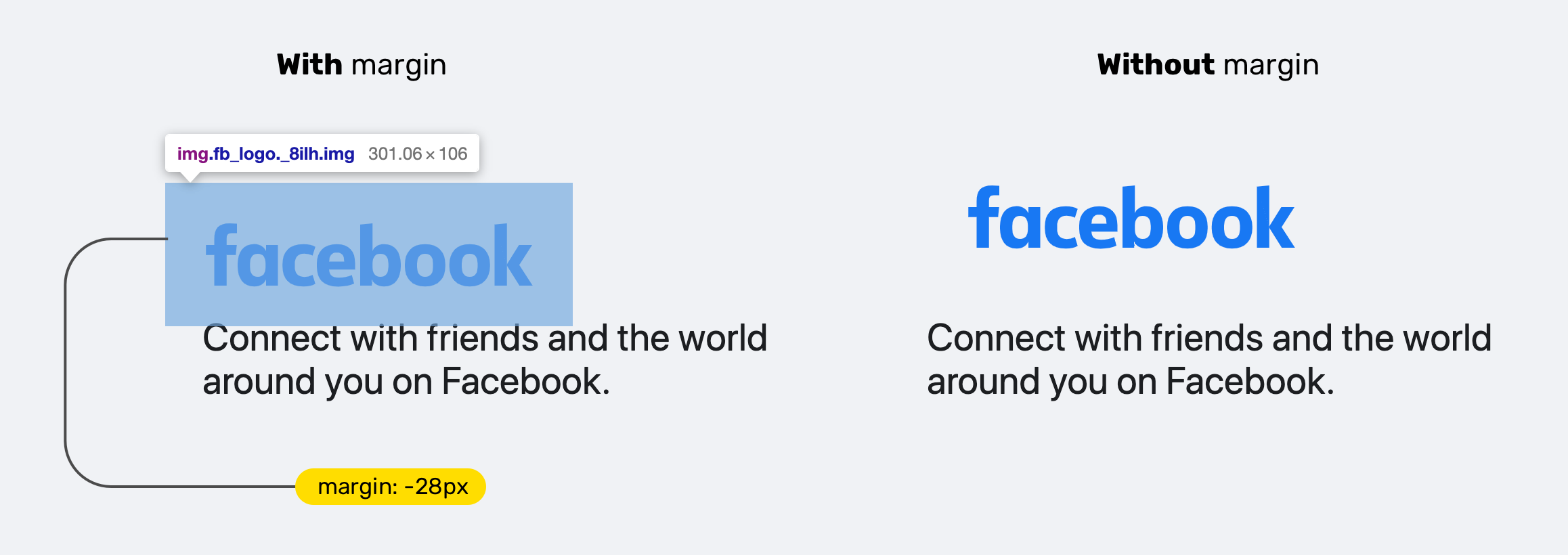
That can be easily solved by trimming the logo image, and then there is no need for the negative margins. :)
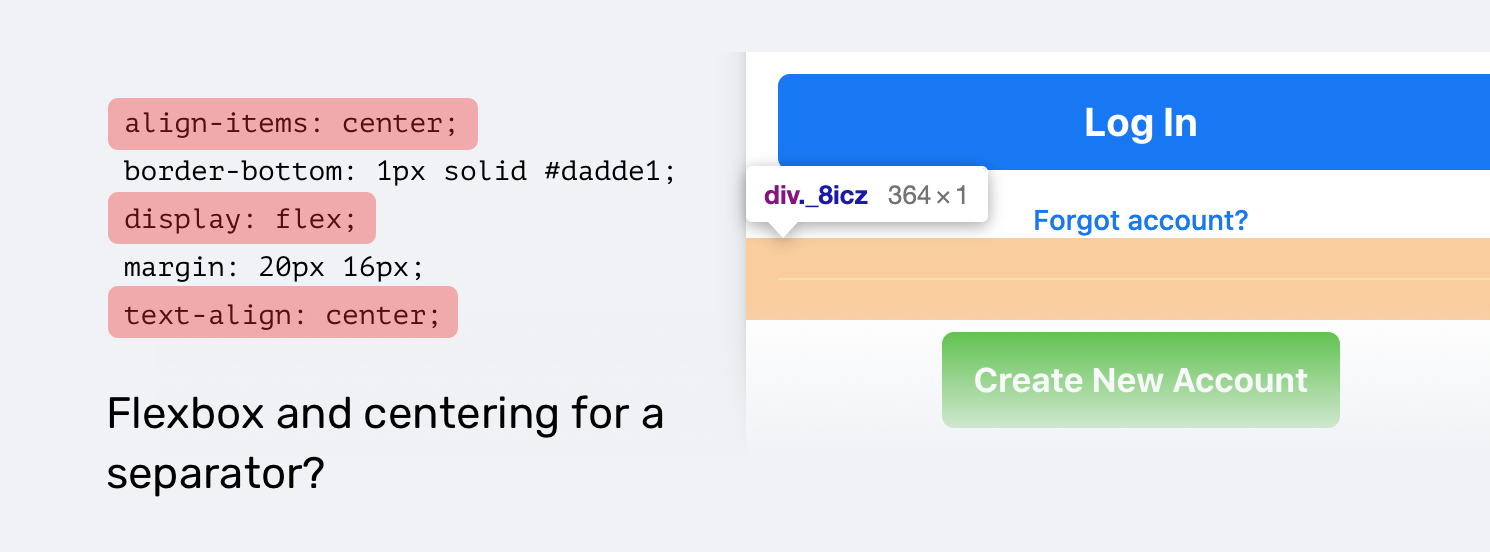
The Separator
There is a separator between the sign up and login inputs. What’s weird is that the separator has display: flex with no clear reason. Maybe this has been forgotten?
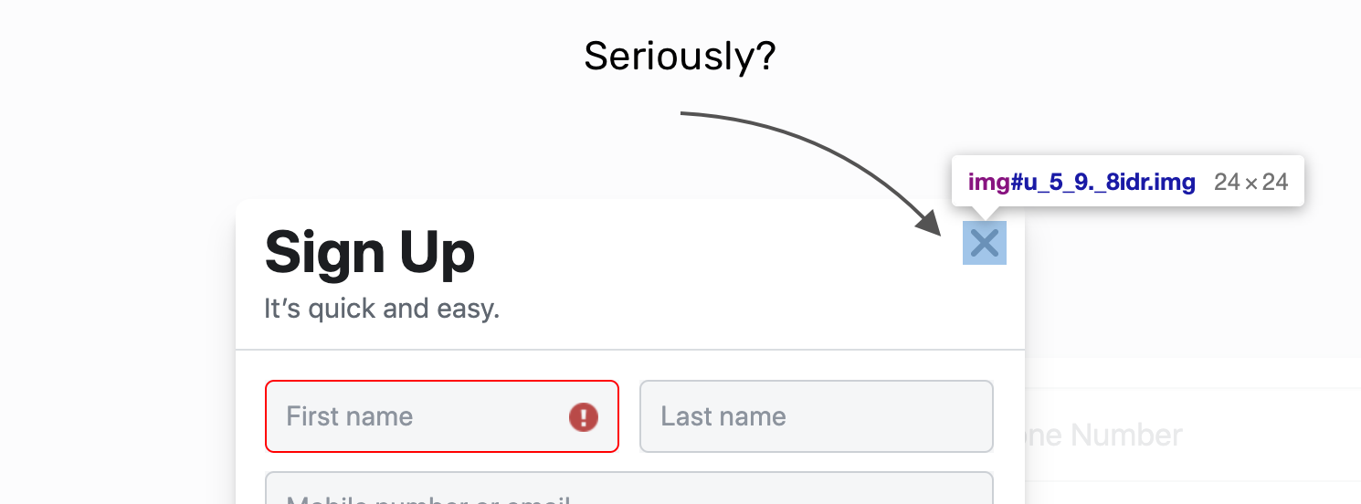
Accessibility
This might not be a CSS finding, but I felt that I should mention this. The sign up modal has a close “x” button. And that button is an <img>. This is a bad accessibility practice.
Seriously, an image? Sorry to see this on Facebook.
Conclusion
What I can learn from this is the following:
- Using old layout methods is fine if it works for you. You don’t need to feel the pressure of blindly using CSS grid or flexbox.
- We might still use those old layout methods to ensure a great experience for all users. Facebook has billions of users, and the login page needs to work perfectly for them.
I’m writing an ebook
I’m excited to let you know that I’m writing an ebook about Debugging CSS.

If you’re interested, head over to debuggingcss.com and subscribe for updates about the book.