The Layout Maestro
A message from the author!
I stumbled upon a project called “Evolution of Web Design”, which shows a web page about Nasa and space. The interesting thing is that there is a slider mimics how the design looked for each year (1993 - 2015). The idea is so inspiring and it challenged me to do the same, which is to get a component or a web page and try to do multiple designs for it without touching the HTML content.
In this article, we will go through an HTML content that should look at different styles without changing the HTML code. It seems like quite a challenge, right?
Through the process of working on each design variation, I will force myself to think deeply and try to come up with a solution. Some times, it’s tempting to add a <div> without thinking and asking ourselves whether it is really necessary?
Before we start, I would like to list the requirements for the result:
- Fully Accessible
- Responsive Design
- Performant
- Progressively Enhanced
UppubDate: 14 Feb 2020
If you started your web career in the old days, you might be familiar with the creative project, CSS Zen Garden. The article is similar to it but on a component level.
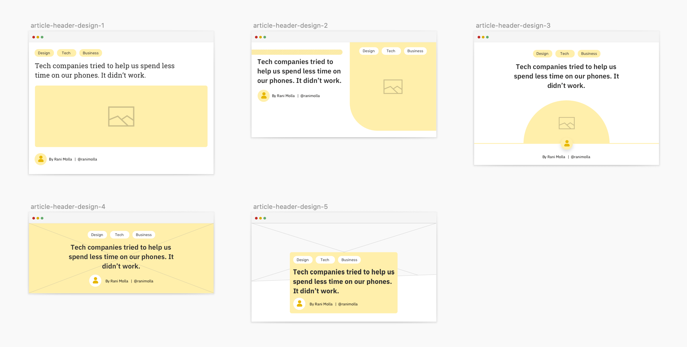
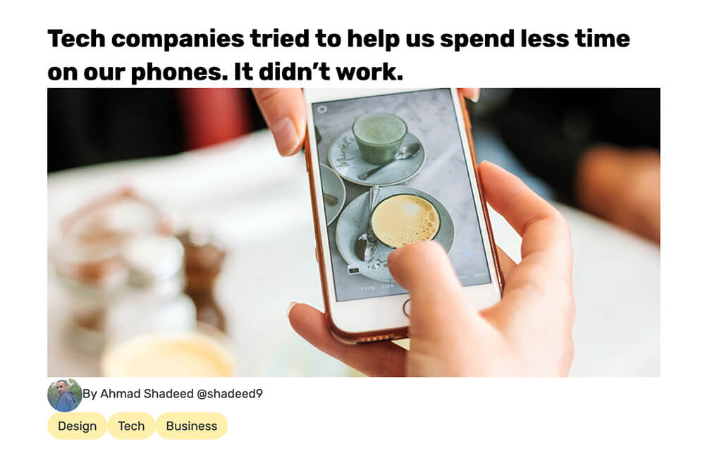
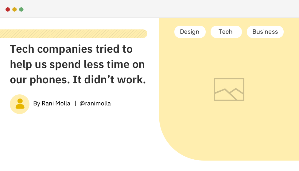
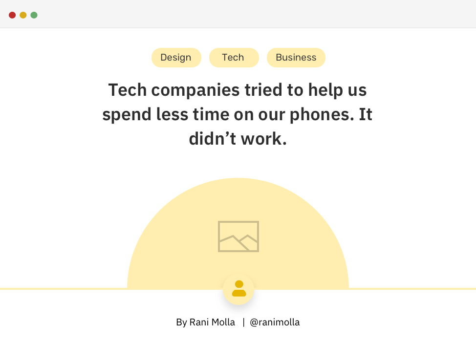
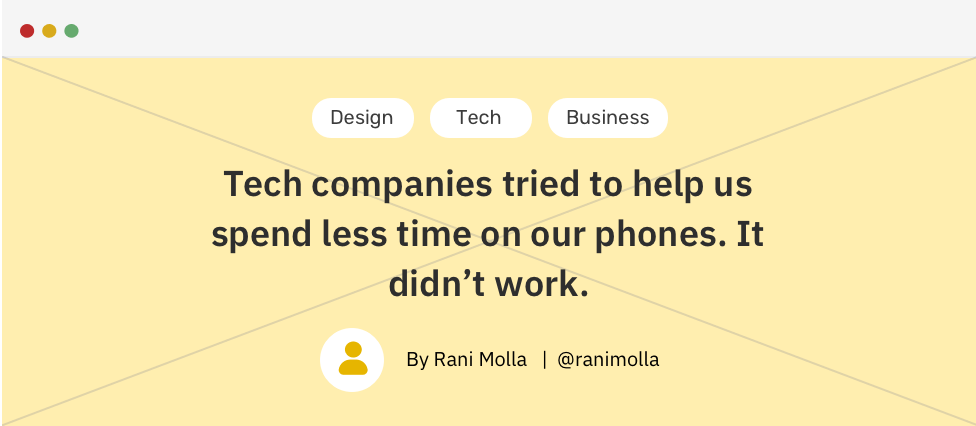
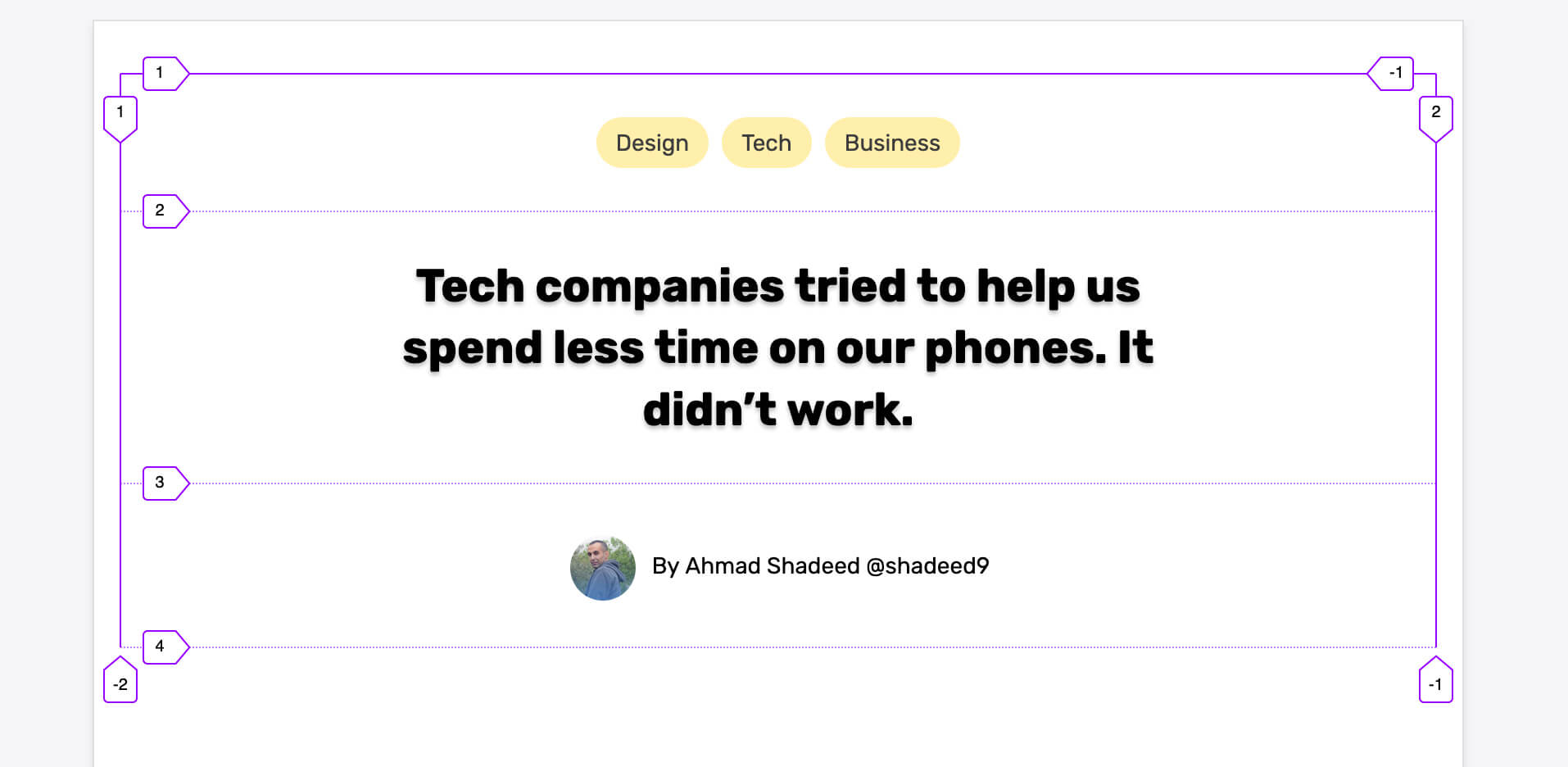
An Article Header
Usually, each article or blog post needs an introductory header before the article body. In this example, we have a header containing a title, a figure, an author and categories. Here is the basic HTML:
<div class="c-entry">
  <h1 class="c-entry__title">
    Tech companies tried to help us spend less time on our phones. It
    didn’t work.
  </h1>
  <img class="c-entry__figure" src="figure.jpg" alt="" />
  <p class="c-entry__author">
    <img class="c-avatar" src="shadeed.jpg" alt="" />By
    <a href="#"><span>Ahmad Shadeed</span></a>
    <a href="#"><span>@shadeed9</span></a>
  </p>
  <ul class="c-list">
    <li class="c-list__item"><a class="c-tag" href="#">Design</a></li>
    <li class="c-list__item"><a class="c-tag" href="#">Tech</a></li>
    <li class="c-list__item">
      <a class="c-tag" href="#">Business</a>
    </li>
  </ul>
</div>
Article Header Design Variations
The challenge is to work on seven variations of the article header, without touching the HTML code. To give you an idea of the final result, see the below video:
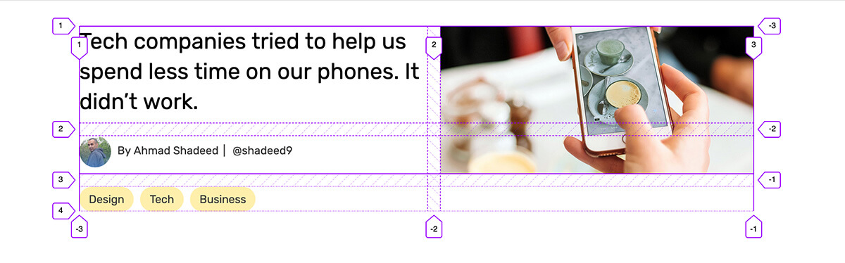
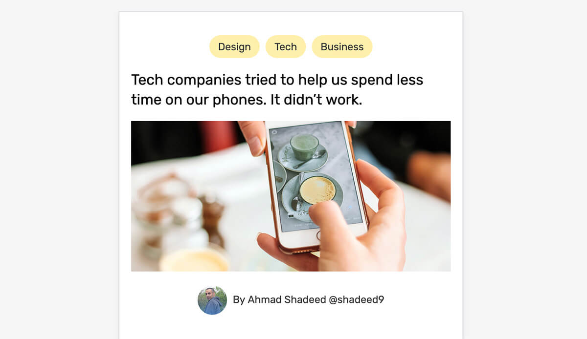
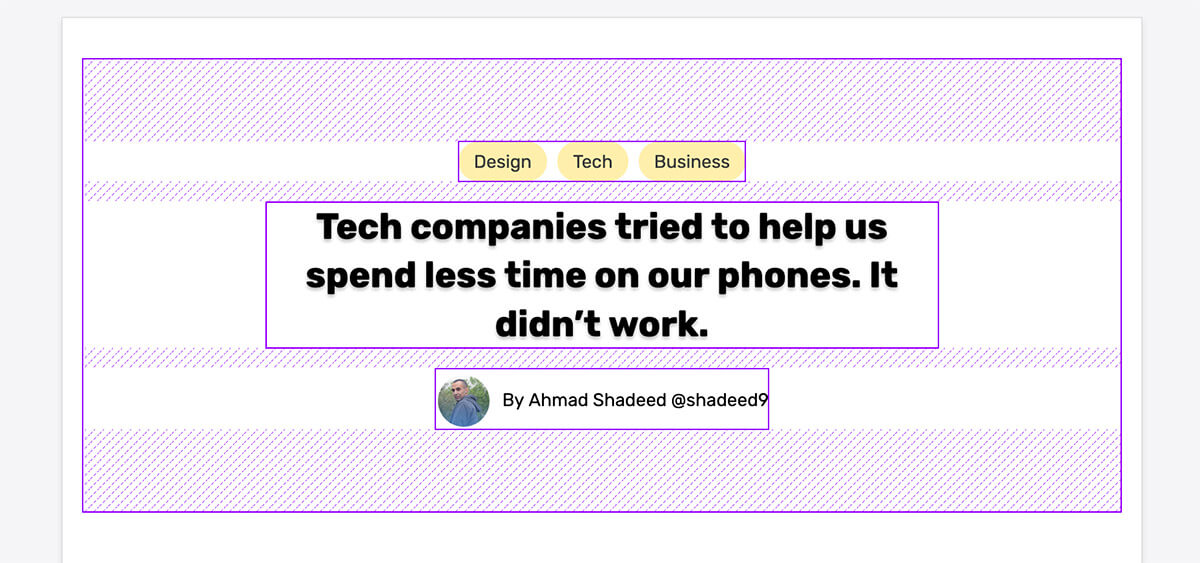
Option 1 - Article Header
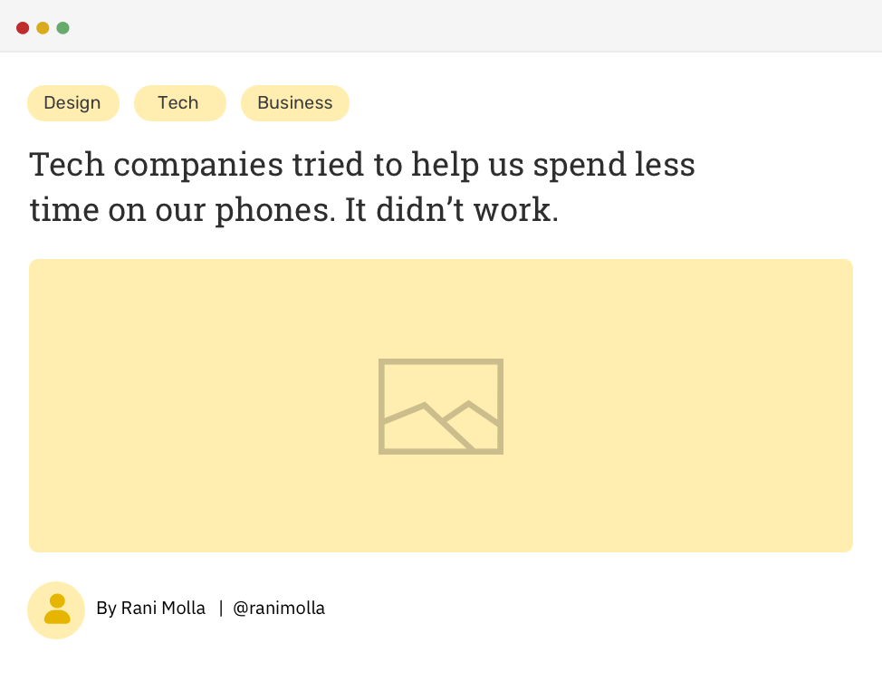
You’ll notice that the order elements in the design is different from the order in the HTML markup. The latest is ordered as follow: title, figure, author, and categories.
I ordered them like this to keep the HTML as semantical as possible. Imagine writing an article on your notebook, what should come first? Definitely the title. For that reason, you should always write your HTML in a semantic way without thinking too much about how it appears visually. Let’s get to work!
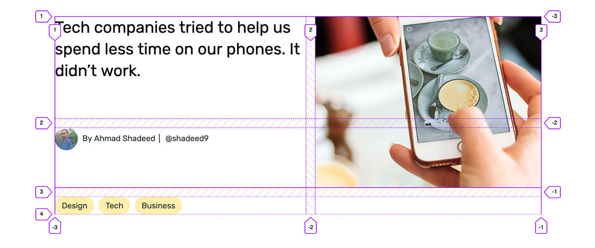
After adding some baseline styles for the elements, the result looks like the figure below.
As per the design variation we are working on, the categories are placed at the top of the article header, so we need to change its order. As far as I know, flexbox is the best way to do that.
.c-entry {
  display: flex;
  flex-direction: column;
}
I changed the direction to column since the default is row so that the child elements are now stacked on top of each other. The next step is to change the order of the categories list.
.c-list {
  order: -1;
}

Now I need to take care of the vertical spacing between the elements. I will avoid adding margins to specific elements as much as I can. Instead, margins will be added to the parent element.
.c-entry > * + * {
  margin-top: 1rem;
  outline: solid 2px;
}
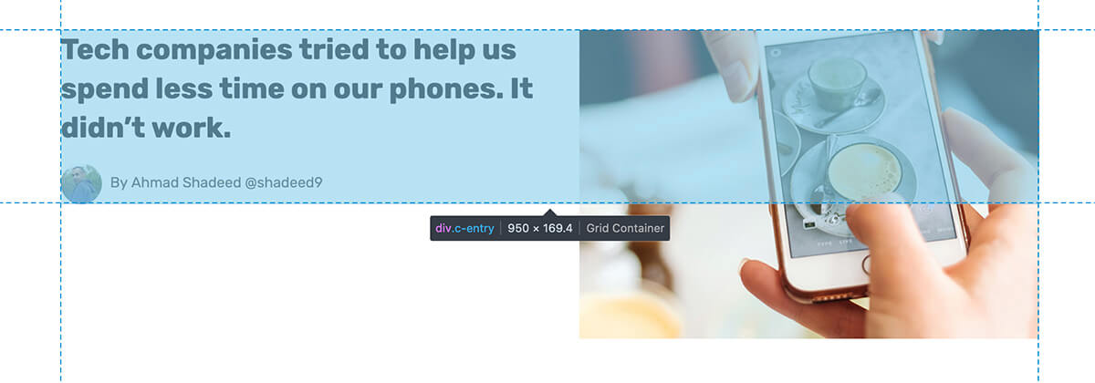
To make it clear, I added an outline to see the elements that got a margin-top. Notice that the categories element is among those elements who got a margin-top. The reason is that CSS added the spacing as per the source order in HTML.
The highlighted areas in blue represent the spacing between elements. Notice that the category has a spacing, which is not needed. The solution is to add margin-bottom for all elements and reset it to 0 for the author element.
/* Select all the direction descendants of `c-entry` element */
.c-entry > * {
  margin-bottom: 1rem;
}

.c-entry__author {
  margin-bottom: 0;
}
Option 2 - Article Header
This variation is a bit more challenging. The layout is divided into two columns and the categories element is centered inside the article figure. A friendly reminder, this should be coded in CSS, without changing the HTML.
The first thing that I got in mind is CSS grid. I added the following CSS:
.c-entry {
  display: grid;
  grid-template-columns: 1fr 0.9fr;
  grid-gap: 1rem;
}

.c-entry__title {
  grid-row: 1 / 2;
  grid-column: 1 / 2;
}

.c-entry__figure {
  grid-row: 1/3;
}
This is the result of the initial CSS. However, the categories list should be placed at the top-right corner. Also, the spacing between the article title and the author should be smaller.
While the above might seem good, it’s not. When the image has a bigger height value, things will get weird.
Notice how the spacing between the title and the author got bigger. That’s because CSS grid adds rows based on the content height. The default alignment for grid items is stretch. To override that, I added align-self: start for the title and author elements.
However, this didn’t solve the issue. I still want to stack the title and the author element below each other. After many trial and error, I moved to another solution.
First, I positioned the figure absolutely and gave it a width of 47% (Yes, it’s 47% because the columns are not equal halves).
.c-entry__figure {
  position: absolute;
  height: 300px;
  right: 0;
  width: 47%;
  object-fit: cover;
}
Then, I added align-content: start to the article header container element. That worked! For the categories list, I also used positioning to make it overlap with the article figure.
.c-entry {
  display: grid;
  grid-template-columns: 1fr 0.9fr;
  grid-gap: 1rem;
  align-content: start;
}

.c-list {
  position: absolute;
  top: 0.5rem;
  right: 0;
  width: 47%;
  justify-content: center;
}
After testing the above, I noticed an interesting issue that I didn’t think about while working on the layout. Due to the figure being positioned absolutely with a fixed height that is bigger than its container, the figure is kind of going out of its container.
That’s an issue because when there are other elements below the article header, the figure will overlap them. To solve that, a min-height should be added to the container, and the figure height should be 100%.
.c-entry {
  min-height: 300px;
  /* other styles */
}

.c-entry__figure {
  height: 100%;
}
Additionally to the code above, I also need to add the yellow bar that before the title.
.c-entry__title {
  position: relative;
  margin-top: 1rem;
  /* other styles */
}

.c-entry--title:before {
  content: "";
  position: absolute;
  left: -1rem;
  top: 0;
  height: 18px;
  width: 90%;
  background: $brand-primary;
  border-top-right-radius: 10px;
  border-bottom-right-radius: 10px;
}
Now that the hardest part is done, it’s time to check how the design will look on smaller screens. Remember that one of our requirements is to create a responsive design.

To achieve the above mockup, I will keep CSS grid, and use the advantage of grid-row-gap to add the spacing. That way, I won’t need margins for the spacing between elements.
.c-entry {
  display: grid;
  grid-row-gap: 1rem;
}

@media (min-width: 550px) {
  .c-entry {
    grid-template-columns: 1fr 0.9fr;
    grid-gap: 1rem;
    min-height: 300px;
    align-content: start;
  }
}
The final result is a responsive article header as shown in the video below.
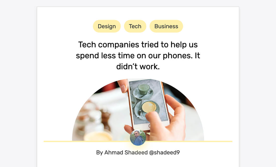
Option 3 - Article Header
The order of elements in this variation is similar to the first one that I worked on with the following differences:
- The figure image is in a half-circle style
- The author’s picture is positioned differently
- There is a border after the figure image
First, I used CSS grid to add the spacing between elements, and center the content:
.c-entry {
  display: grid;
  grid-row-gap: 1rem;
  justify-items: center;
}
Then, I needed to move the categories list to the top, so I used the order property again. I learned that it works with CSS grid too!
.c-list {
  order: -1;
}
The next step, is to limit the width of the title and center it with text-align. I chose to use the character and viewport units because they allow us to have a dynamic width that is proportional to the viewport and content.
.c-entry__title {
  max-width: calc(25ch + 5vw);
  text-align: center;
}
Then, the author’s picture needs to be taken care of. I used the good old CSS positioning for that, since it fits the use case quite perfectly.
.c-entry__author .c-avatar {
  position: absolute;
  left: 50%;
  top: -200%;
  transform: translateX(-50%);
}
The last part is the yellow line that is below the figure image. How should this one be handled? Just for clarification purposes, here it is:
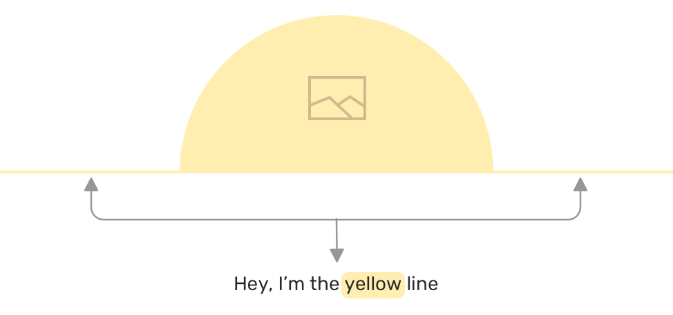
I thought about adding the line as a pseudo-element for the author. However, I noticed that the author element doesn’t use the full width of its parent.
The reason is that I added justify-items: center for the container element .c-entry. That caused the element to be resized to fit its content only. To override that, I simply reset the justification for the author element like this:
.c-entry__author {
  justify-self: normal;
  /* other styles */
}
Now, I can just add a pseudo-element to represent the line across the width of the container.
.c-entry__author:before {
  content: "";
  position: absolute;
  left: 0;
  right: 0;
  top: -1rem;
  height: 3px;
}
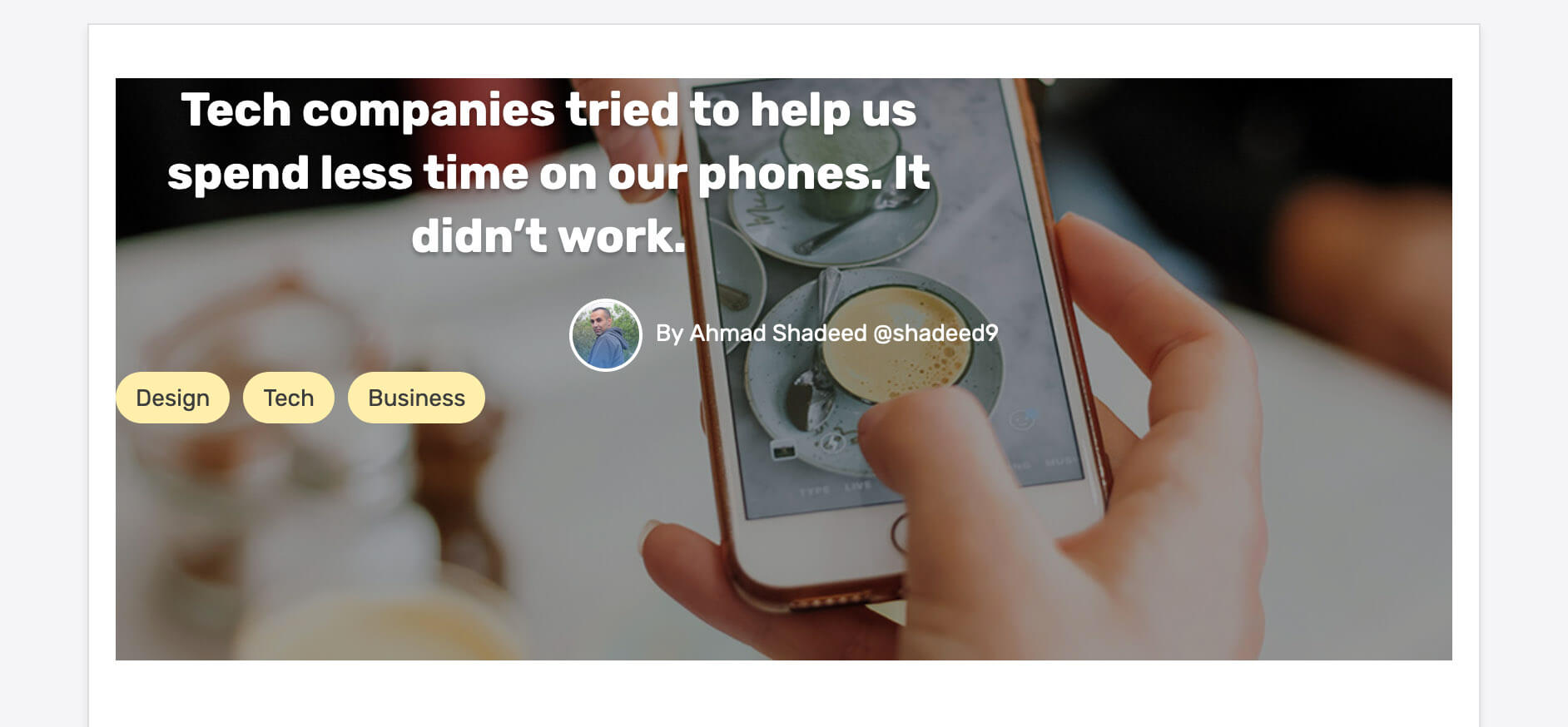
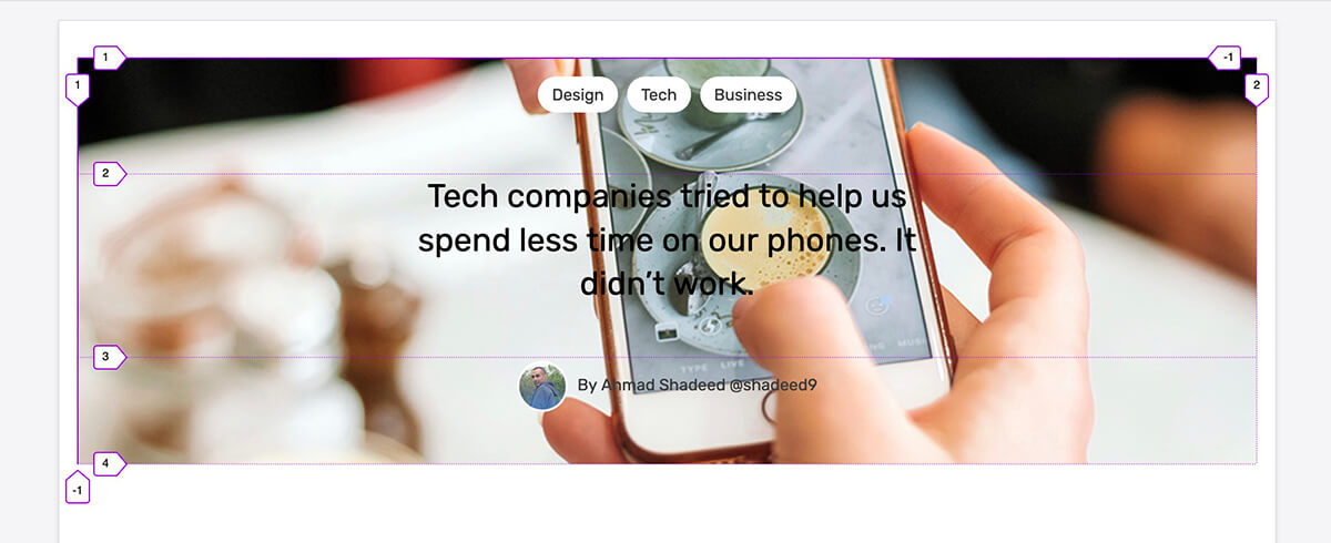
Option 4 - Article Header
For this variation, the figure is positioned below all the content, with a transparent overlay to help making the content readable. The first thing I did is, positioning the figure and added a pseudo-element for the overlay.
.c-entry:after {
  content: "";
  position: absolute;
  left: 0;
  top: 0;
  background: #000;
  width: 100%;
  height: 100%;
  z-index: -1;
  opacity: 0.4;
}

.c-entry__figure {
  position: absolute;
  left: 0;
  top: 0;
  z-index: -1;
  width: 100%;
  height: 100%;
  object-fit: cover;
}
The current result looks like the screenshot below. Note that the elements are not ordered properly and need to be positioned.
At first, I thought about using CSS grid to center the elements, however, I faced some challenges to center them correctly as there were unneeded spaces between them. I then tried the following CSS:
.c-entry {
  display: grid;
  align-items: center;
  justify-items: center;
}
See how each element is centered horizontally and vertically in its row. While this might look correct, it’s not the desired result.
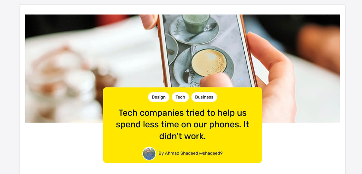
With flexbox, things can be different. The centering happens across the container, not like what grid did. So I added the following:
.c-entry {
  display: flex;
  flex-direction: column;
  justify-content: center;
  align-items: center;
}
Isn’t flexbox better? With this last change, we’re actually done with this variation. The final result looks like the image below.

Option 5 - Article Header
At first glance, working on this variation seemed a bit complex to me. How would I wrap the categories, title, and the author in one element when the HTML looks like this:
<div class="c-entry">
  <h1 class="c-entry__title"><!-- Title --></h1>
  <img class="c-entry__figure" src="figure.jpg" alt="" />
  <p class="c-entry__author"></p>
  <ul class="c-list"></ul>
</div>
Note how there is no wrapping div for the elements mentioned above… So let’s explore how I thought about solving this one.
With CSS grid applied, the elements look like the screenshot below:
Now, I need to align all of them to the center, and the end of their containing element. So I used justify and align properties as shown in the code below:
.c-entry {
  /* other styles */
  justify-content: center;
  align-content: end;
}
With that, I can now add a pseudo element to each of the categories, title and author. This pseudo element will act as a background for them.
.c-entry__title:after,
.c-entry__author:after,
.c-list:after {
  content: "";
  background: #ffe649;
  position: absolute;
  left: 0;
  top: 0;
  width: 100%;
  height: 100%;
  z-index: -1;
}

Since each of those elements have a position: relative applied to them, we can use the top property to shift them down a bit.
.c-entry__title,
.c-entry__author,
.c-list {
  position: relative;
  top: 130px;
}
Finally, the box needs rounded corners, so I will add them to the first and last elements only.
.c-list:after {
  border-top-right-radius: 10px;
  border-top-left-radius: 10px;
}

.c-entry__author:after {
  border-bottom-left-radius: 10px;
  border-bottom-right-radius: 10px;
}
UppubDate: 18 Feb 2020
Overusing the order property might affect the user experience. When used, the focus order will be based on the HTML source order, not the visual order. Thanks to Geoffrey Crofte for pointing this out!
Final Words
Coming up with five variation for the article header wasn’t easy. Coding them was even harder. With this experiment, I learned new things and got a good reminder that it’s important to think before changing the HTML when a design has changed. CSS is powerful and capable of doing amazingly beautiful things. Let’s embrace that and keep the HTML semantical instead of adapting it to the need of the next design change.
The End
That’s a wrap. Do you have a comment or a suggestion? Please feel free to ping me on @shadeed9.
Thanks
Big thanks to Michaël Vanderheyden for his help in proofreading the article.